
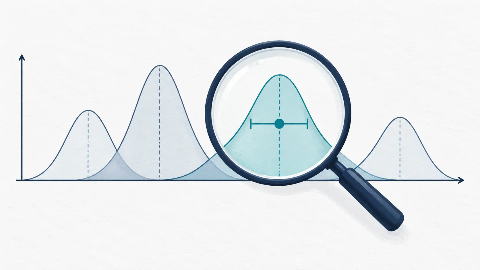
NRMP's Charting Outcomes is the best public data the Match produces, and the most misread. Applicants open the specialty table, find the median Step 2 CK of matched IMGs, compare it to their own score, and walk away either falsely reassured or needlessly crushed. Both readings make the same mistake: treating a cohort summary as a personal prediction.
What the tables actually say
A median is the middle of a distribution, not its entrance requirement. When matched IMGs in a specialty show a median of, say, 245, half of the people who matched scored below it. The table describes who matched; it does not state what was required, and it says nothing about why any individual succeeded, the letters, the USCE, the interview, the rank list, none of which appear in the chart.
The misreadings, catalogued
- Median-as-floor: "the median is, say, 245 and I have 240, so I cannot match." Half the matched cohort is standing on the other side of that sentence.
- One number at a time: reading the score chart in isolation, when outcomes move with experience, research, visa need, and graduation year jointly. The tables are marginal views of a joint reality.
- Ignoring the denominator: small specialties and small IMG cohorts make for noisy charts; a two-point shift in a median of forty people is weather, not climate.
- Survivorship: the tables describe people who applied and matched, filtered through self-selection at every step. They cannot tell you what happens to a profile nobody like you has tried.
- Staleness: each edition describes a past cycle. Signalling rules, score policies, and application behaviour have all shifted between editions; direction usually survives, exact numbers often do not.
Cohort data answers "what did the field look like". It cannot answer "what should I do". The second question needs your whole profile, not one of its numbers.
How to use it well
Used properly, Charting Outcomes is a reality instrument. It tells you which specialties take IMGs in meaningful numbers and which almost never do; it shows you roughly where your strongest dimension sits against the matched cohort; and it kills fantasies cheaply, before they cost you an application season. Read it to choose where to compete and what to strengthen. Do not read it to learn your odds; no single chart holds them.
Takeaways
- Medians describe the middle of the matched cohort, never a cutoff.
- Judge your profile jointly, the way programmes do, not one chart at a time.
- Use the tables to pick your battlefield; use your whole profile to plan the battle.